
Cursor AI pricing, explained: what the page tells a buyer, and what it hides
Cursor's pricing page, read as a buyer on September 5, 2026: Hobby is free, Individual is $20 a month for the Pro plan, Teams is $40 per user per month, Enterprise is custom. Seven plans are presented as four, because Pro+, Ultra, and Teams Premium prices sit behind in-card switches and never appear on load; every usage limit is an adjective; and a company of twenty-five cannot tell from the page whether it belongs on Teams or Enterprise. A second study reads the homepage cold and finds that the pricing page positions Cursor better than the homepage does.
Pricing teardown
Free to start, $20 a month for one person, $40 a seat for a team, and they push Pro. But every limit is an adjective and the other prices are behind a switch, so a buyer cannot tell what they would pay if they actually used it.
What a buyer pays, as of Sep 5, 2026
| Buyer | Tier the page steers to | Monthly | Yearly | Can the buyer reach it? |
|---|---|---|---|---|
| Solo user | Individual, Pro | $20 | $240 | Base price yes; the real bill no. Usage-based components carry no unit price. |
| Team of 5 | Teams, Standard | $200 ($40 x 5) | $2,400 | Yes, if they catch "/user/mo." |
| Company of 25 | Teams or Enterprise | $1,000 ($40 x 25), or unknown | $12,000, or unknown | Cannot determine. Enterprise is "Custom" with no seat threshold. |
What the study found
- The pricing model changes between neighboring cards, in small type. Individual is a flat $20 a month; Teams is $40 per user per month. A buyer reads a $20 step between the cards; for a five-person team the real step is $180 a month.
- Seven plans are presented as four. Individual hides Pro, Pro+, and Ultra behind an in-card switch, and Teams hides Standard and Premium. The Pro+, Ultra, and Premium prices never appear on load; the headline $20 is the cheapest of three.
- Every limit is an adjective: 'Limited Agent requests', 'Extended limits on Agent', 'Generous limits for Grok'. No number, unit price, or overage rate appears on any card, so a heavy user cannot price themselves.
- Enterprise is 'Custom' with no seat threshold and no starting price. A 25-seat company cannot tell whether it belongs on Teams or must contact sales.
- On a phone, only the free Hobby card is visible at the fold. The pushed Get Pro tier and the per-seat Teams unit sit several screens down, and tiers can no longer be compared side by side.
Read the full study
Cursor pricing teardown
Published 2026-09-05 via Cobalt Capture.
Reviewing: https://cursor.com
Summary
Cursor pricing teardown
The price story the page tells a buyer: "Free to start, $20 a month for me, $40 a seat if I bring my team, and they want me on Pro. But every limit is an adjective and the upgrade prices are behind a switch, so I can't tell what I'd pay if I actually use it."
Buyer math (monthly billing, the page's default state):
| Buyer | Tier the page steers to | Monthly | Yearly | Can the buyer reach it? |
|---|---|---|---|---|
| Solo user | Individual, Pro | $20 | $240 | Base price yes; the real bill no. Usage-based components carry no unit price. |
| Team of 5 | Teams, Standard | $200 ($40 x 5) | $2,400 | Yes, if they catch "/user/mo." |
| Company of 25 | Teams or Enterprise | $1,000 ($40 x 25), or unknown | $12,000, or unknown | Cannot determine. Enterprise is "Custom" with no seat threshold. |
MISLEADS: a buyer would misjudge the cost or their tier
- The pricing model switches between neighbors, in small type. Individual is a flat "$20/mo."; Teams is "$40/user/mo." A buyer reads a $20 step between the two cards; for a five-person team the real step is $180 a month. Direction: set the per-seat unit at the same size as the price and show one worked example ("5 people: $200/mo").
- Seven plans are presented as four. Individual hides Pro / Pro+ / Ultra and Teams hides Standard / Premium behind in-card switches. The prices of Pro+, Ultra, and Premium never appear on load; the headline "$20/mo." is the cheapest of three. Direction: show every plan's price on load, or label each switch with its price range.
STALLS: the buyer cannot decide from the page
- Every limit is an adjective. "Limited Agent requests", "Extended limits on Agent", "Generous limits for Grok", "Bugbot on usage-based billing". No number, no unit price, no overage rate anywhere on the cards. A buyer cannot know what an Agent request is or how many they get, so a heavy user cannot price themselves. Direction: put the numbers on the cards.
- Enterprise is fog. "Custom" with no seat threshold or starting price. A 25-seat company cannot tell whether it belongs on Teams or must contact sales. Direction: name the gate.
- The upgrade story inside Individual is invisible. Nothing on load says what Pro+ or Ultra add or who they are for. Direction: one line per sub-tier.
- Load-bearing terms are undefined where the buyer decides. Composer, Bugbot, Grok Bot, Cloud agents, MCPs carry the value and are never explained on the pricing page. Direction: define the three that matter, one sentence each.
FRICTION
- Phone collapses the comparison. Only the free Hobby card is visible at the fold; the highlighted Get Pro tier and the per-seat Teams unit sit several screens down, and tiers can no longer be compared side by side.
- Yearly pricing is hidden by default. The page opens on Monthly; the annual price and any discount require a click.
Keep (do not regress)
- The audience-named ladder (Hobby / Individual / Teams / Enterprise) tells a buyer which row is theirs instantly.
- "No credit card required" is stated plainly on the free tier.
- The pushed tier is the cheapest paid plan. Get Pro at $20, not the most expensive card. Honest nudging.
- Trust at the ask: a named logo wall (Stripe, OpenAI, Linear, Datadog, NVIDIA, Figma, Ramp, Adobe), SOC 2 / ISO 27001 / AIUC-1 marks, and a Contact sales route beside the calls to action.
- The Q&A anticipates the real questions: "What is the right plan for me?", "How does usage-based pricing work?", "Are prices inclusive of taxes?"
Coverage
Judged in the page's default state: Monthly billing, Pro, Standard. The Yearly prices, the Pro+ / Ultra / Premium prices, and the Q&A answers sit behind clicks that server-side rendering cannot make, so they were not captured. The default state is what most visitors see on arrival, and its gaps are the findings above.
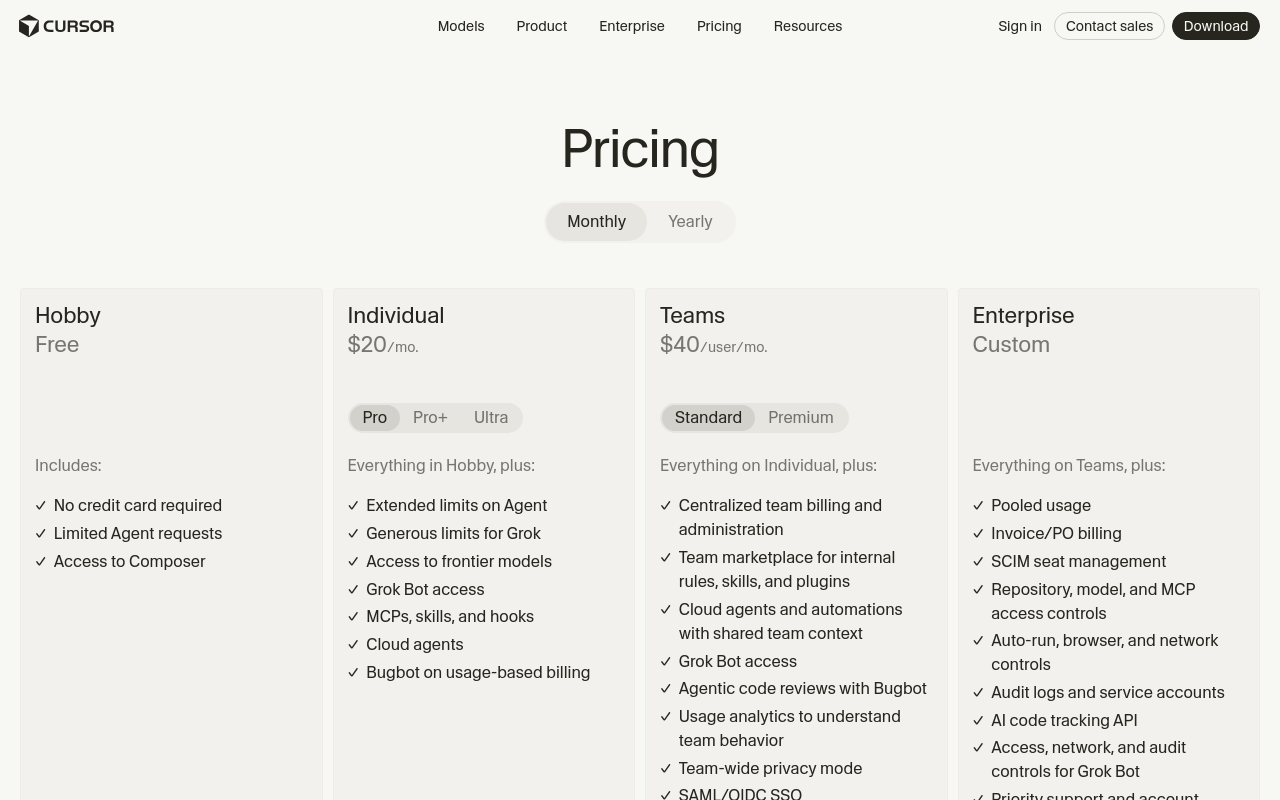
Pricing page, desktop fold
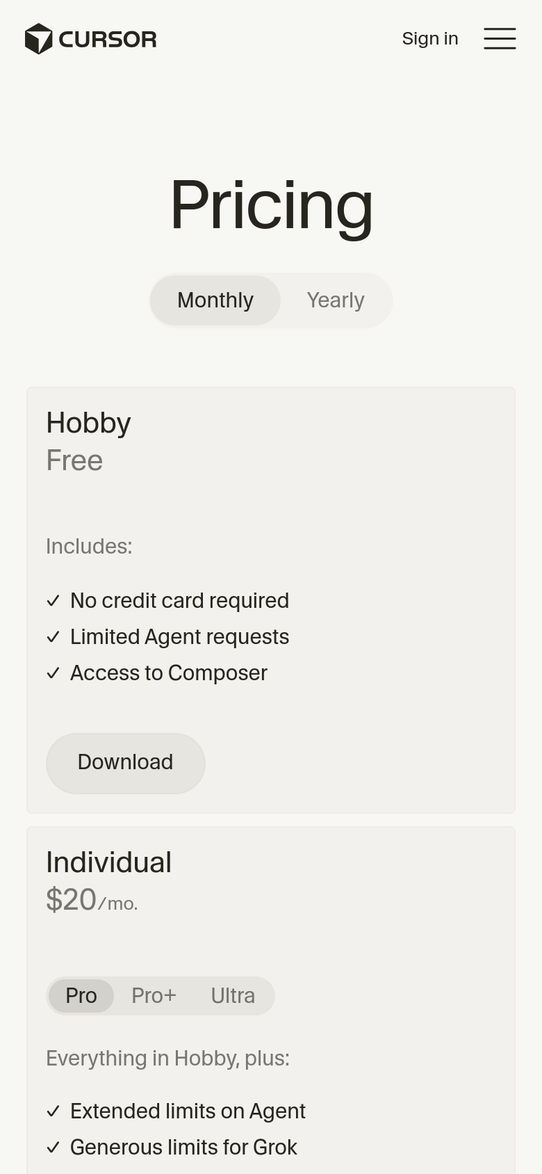
Pricing page, phone fold
Pricing page, full desktop overview
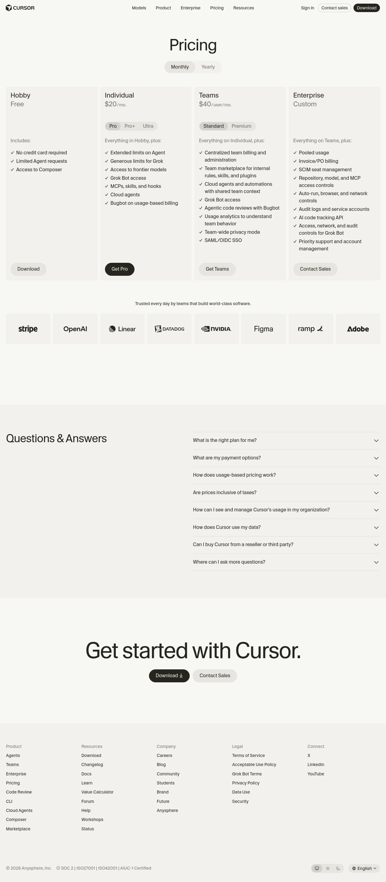
First impression, desktop. Judged from the fold alone, before scrolling.
-
How many plans? The fold shows four: Hobby, Individual, Teams, Enterprise. But two cards hide a second row of choices. Individual carries a Pro / Pro+ / Ultra switch and Teams carries a Standard / Premium switch. That is seven plans presented as four. A buyer counts four; the real menu is seven.
-
Which one is mine? The tier names answer this well; the ladder is named by audience. Inside Individual, though, nothing on the fold says who Pro+ or Ultra is for. They are labels without a sentence.
-
What does it cost? Only the default of each switch shows a number: Individual "$20/mo." (Pro only), Teams "$40/user/mo." (Standard only), Enterprise "Custom". The Pro+, Ultra, and Premium prices sit behind clicks and never appear on load. The unit also changes between neighbors: Individual is a flat monthly price, Teams is per user, and the "/user/mo." is set in smaller type than the number.
Default state captured: Monthly billing, Pro, Standard. The Yearly price and the other sub-tiers were not visible without clicking, so this study judges the page most visitors see on arrival.
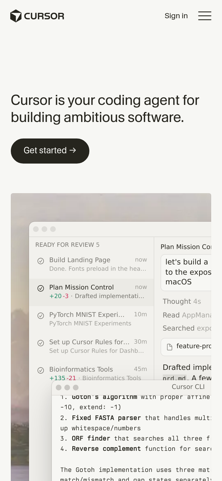
First impression, phone. The four-card comparison becomes a single column. At the fold the buyer sees the title, the Monthly / Yearly switch, and the Hobby card only: "Free", "No credit card required", a Download button. The first paid plan starts below the fold, and Teams, Enterprise, and the highlighted Get Pro button sit several screens down.
On a phone the buyer meets the free tier first and cannot compare tiers side by side at all. "Which one is mine" means scrolling the whole ladder and holding it in memory. The per-seat unit on Teams, already small on desktop, is the last thing a phone buyer reaches.
Three buyers work the numbers (monthly billing, the default; per seat where the page says so).
- Solo user. Individual, Pro: $20 x 12 = $240 a year. The base price is reachable. But "Extended limits on Agent" and "Bugbot on usage-based billing" mean the bill rises with use, and no unit price or limit appears anywhere on the card. A heavy user cannot determine their real monthly cost from this page.
- Team of 5. Teams, Standard: $40 x 5 = $200 a month, $2,400 a year. Reachable, but only if the buyer catches "/user/mo." The headline reads as a $20 step up from Individual; for five people it is a $180 step. Premium's price is hidden behind the switch.
- Company of 25. Teams: $40 x 25 = $1,000 a month, $12,000 a year, if Teams is allowed at that size. Enterprise is "Custom" with no seat threshold and no starting price, so the buyer cannot determine whether 25 seats belongs on Teams or must talk to sales.
Where the structure stalls a decision. Every limit on the page is an adjective, not a number: "Limited Agent requests", "Extended limits on Agent", "Generous limits for Grok". A buyer must know what an Agent request is, and how many they get, to price themselves, and the page never says. The upgrade story between Pro, Pro+, and Ultra is invisible on load. The feature names carry the value (Composer, Bugbot, Grok Bot, Cloud agents, MCPs) but none is defined where the buyer is deciding. The Q&A does hold "How does usage-based pricing work?" and "Are prices inclusive of taxes?", which shows the company knows these are the open questions; the answers sit inside collapsed accordions.
What earns trust at the ask. "No credit card required" is stated plainly on the free tier. The pushed tier, Get Pro, is the cheapest paid plan, not the most expensive, which is honest nudging. A named logo wall (Stripe, OpenAI, Linear, Datadog, NVIDIA, Figma, Ramp, Adobe), SOC 2 / ISO 27001 / AIUC-1 marks, and a Contact sales route all sit near the calls to action. Nothing on the page manufactures scarcity.
Made with Cobalt Capture.
Open the live review for the export buttons (markdown, PDF, Word) and the share card.
Run this on your product
Connect the Cobalt server once, then ask for a pricing teardown of your own site. Replace the placeholder URL with yours.
-
Claude Code
/mcp__cobalt__pricing_teardown https://your-product.com -
Codex
Run: curl -s https://cobaltcapture.com/playbooks/pricing-teardown.md Then follow it exactly against https://your-product.com -
Cursor, VS Code, Claude chat, Perplexity
Run a pricing teardown of https://your-product.com
Claude Code runs it as a slash command once the server is connected. Codex has no slash commands: connect with codex mcp add cobalt --url https://cobaltcapture.com/mcp, then paste the two lines. Cursor and VS Code connect with the button above, then take the sentence. In Claude chat or Perplexity, add https://cobaltcapture.com/mcp as a connector and ask in plain words; this study reads public pages, so it runs in full there. What this study checks.
Positioning teardown
The site is clear on what Cursor does, silent on who it is for, and unconvincing on why this one. The pricing page positions Cursor better than the homepage does.
What the study found
- The homepage fold leads with 'your coding agent' and drops the word 'editor' that Cursor built its name on. Paired with a hero showing an autonomous review queue, a cold visitor can picture a cloud bot rather than the IDE they download and code in.
- It fails the swap test. '[Any AI coding tool] is your coding agent for building ambitious software' survives with Copilot, Claude Code, or Windsurf swapped in; 'ambitious software' names no user, no job, and no outcome.
- The audience is named on the pricing page (Hobby, Individual, Teams, Enterprise) but not on the homepage, which straddles 'Download for Windows' and 'Contact sales' in the same fold.
- The real differentiators (Composer, Bugbot, agentic code review, cloud agents) appear only as undefined checkbox items on the pricing page. They are shown, never sold or explained.
- On a phone, the concrete 'Download for Windows' becomes a vague 'Get started' that points at a desktop-only product, and the hero screenshot crops away the evidence for the agent claim.
Read the full study
Cursor positioning teardown
Published 2026-09-03 via Cobalt Capture.
Reviewing: https://cursor.com
Summary
Cursor positioning teardown
What the site actually transmits (cold-visitor version): "Cursor is an AI coding agent for building software, used by big-name engineering teams." Clear on what, silent on who, and unconvincing on why this one, the three things the homepage fold has to land, and it lands one.
The deeper you go, the sharper the positioning gets, which is the core problem: the pricing page positions better than the homepage does.
GARBLED, a target visitor could misread what this is
- The homepage traded its anchor for a crowded category. The fold leads with "your coding agent" and drops the "editor" word Cursor built its name on. Paired with a hero showing an autonomous "Mission Control" review queue, a cold visitor can plausibly picture a Devin-style cloud bot rather than the IDE you download and code in. Losing "editor" loses the one word that told people where Cursor fits. Direction: keep the agent claim, but re-anchor that it's the editor/IDE the agent lives in, the category you own, not the one everyone's crowding into.
MUDDY, understandable but unconvincing or generic
- Fails the swap test. "[Any AI coding tool] is your coding agent for building ambitious software" survives replacing "Cursor" with Copilot, Claude Code, or Windsurf, unchanged. "Ambitious software" is aspirational filler, no user, no job, no outcome. Direction: lead with the specific wedge (the IDE + one named capability), not the category everyone asserts.
- The audience is named on the pricing page but not the homepage. Pricing's Hobby / Individual / Teams / Enterprise ladder instantly tells you which row is yours; the homepage names no one and straddles "Download for Windows" (solo) against "Enterprise / Contact sales" in the same fold. Direction: pull the audience ladder up to the homepage.
- The real differentiators are buried as undefined jargon. Pricing lists Cursor's actual moats, Composer, Bugbot, Grok Bot, "MCPs, skills, and hooks," agentic code review, as bare checkboxes. These are the "why Cursor," shown but never sold or defined. Direction: surface and explain the one or two that matter most, up front.
- The headline price under-represents the decision. "Individual, $20/mo" is only the "Pro" sub-tier; a hidden Pro / Pro+ / Ultra toggle is the real choice. The Q&A's "What is the right plan for me?" is answering confusion the layout created. Direction: expose the real pricing axis instead of anchoring on the lowest number.
- Mobile first impression is weaker than desktop. The concrete "Download for Windows" becomes a vague "Get started" that points a phone visitor at a desktop-only product, and the hero screenshot doesn't reflow, the message-bearing panels crop off-screen, so the proof of the "agent" claim mostly vanishes on the phone fold. Direction: a mobile-aware CTA and a mobile-legible piece of proof.
COSMETIC
- The closing "Get started with Cursor" repeats the vague CTA + dual download-or-sales path.
Clearest moments (do not regress)
- The logo wall, "teams that build world-class software" over Stripe, OpenAI, Linear, Datadog, NVIDIA, Figma, Ramp, Adobe, plus SOC 2 / ISO certs. Best positioning asset on the site; it says "serious teams run this" better than any headline.
- The pricing audience ladder (Hobby / Individual / Teams / Enterprise), textbook "which one is mine."
- The desktop hero screenshot, real, specific evidence of the agent working, not a stock mockup.
Coverage gap
/agentsblocked automated rendering (a bot challenge that fires on automation, not on real visitors), so that page, where the new "agent" claim should be proven hardest, wasn't audited. Worth a manual look; it may already answer the GARBLED finding above.
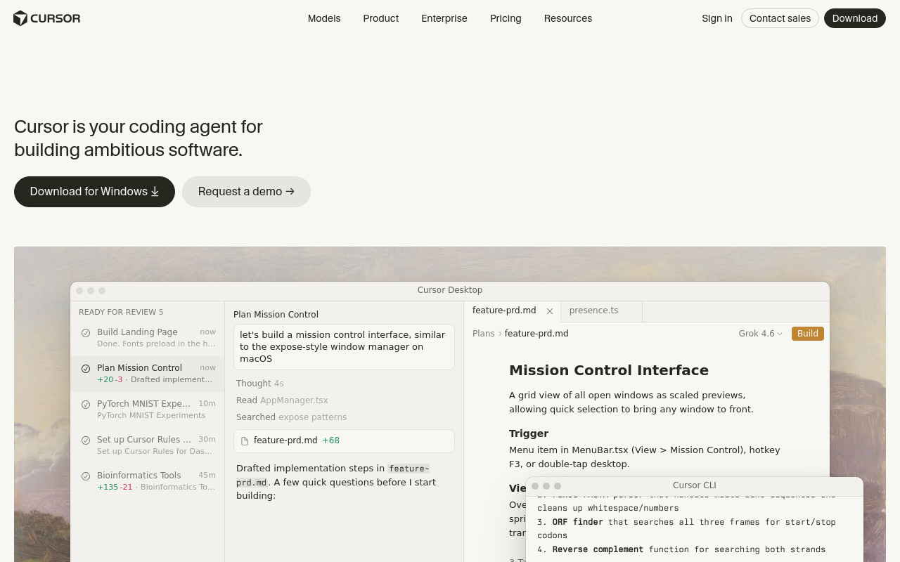
Homepage, desktop fold (five-second test)
Five-second test, desktop fold. Reacting to only what's above the fold, before scrolling.
-
What does it do? "Cursor is your coding agent for building ambitious software." So: an AI coding agent. Notable, this is a category shift. Cursor built its name as "the AI code editor"; the fold now leads with "agent," planting a flag in the crowded agent category rather than the editor one it owned. The hero screenshot (a "Mission Control" review queue, agents drafting code) backs the agent claim with real product evidence, which is the fold's strongest asset.
-
Who is it for? Not named. Implied developers, but the fold straddles two audiences without choosing: "Download for Windows" (solo dev, grab-it-now) sits one line above a nav carrying "Enterprise" and "Contact sales." A cold visitor can't tell if this is a tool they download or a platform they book a demo for.
-
Why believe it / why this over the alternative? The weakest of the three. The fold asserts capability but offers zero differentiation, nothing says why Cursor over Copilot, Claude Code, Windsurf, or Devin. Swap test: "[Any AI coding tool] is your coding agent for building ambitious software" survives almost unchanged. "Ambitious software" is aspirational filler doing no positioning work, it names no user, no job, no outcome.
Headline verdict: clear enough on what (an agent), unconvincing on why this one, and silent on who.
Homepage, mobile fold
Five-second test, mobile fold.
- What / 2. Who / 3. Why read the same as desktop off the headline, which scales well and stays legible. But two mobile-specific problems:
-
The CTA weakens. Desktop's concrete "Download for Windows" becomes a vague "Get started →" on mobile. Worse, Cursor is a desktop IDE, there's no product to run on a phone, so "Get started" on the mobile fold points a visitor at something they can't actually do from that device. It should acknowledge the phone context ("Get it on your desktop" / email-me-the-link), not pretend.
-
The proof degrades to a fragment. The hero screenshot is a desktop IDE window shown at phone width with no reflow, you get a cropped left slice ("READY FOR REVIEW 5" queue) while the message-bearing right panels (the agent's plan, the diff, the reasoning) run off-screen and truncate ("Plan Mission Co…", "let's build a… to the expos…"). On desktop this screenshot was the strongest evidence for the "agent" claim; on the phone fold, often the first impression that counts, that evidence is mostly gone.
Pricing page, desktop
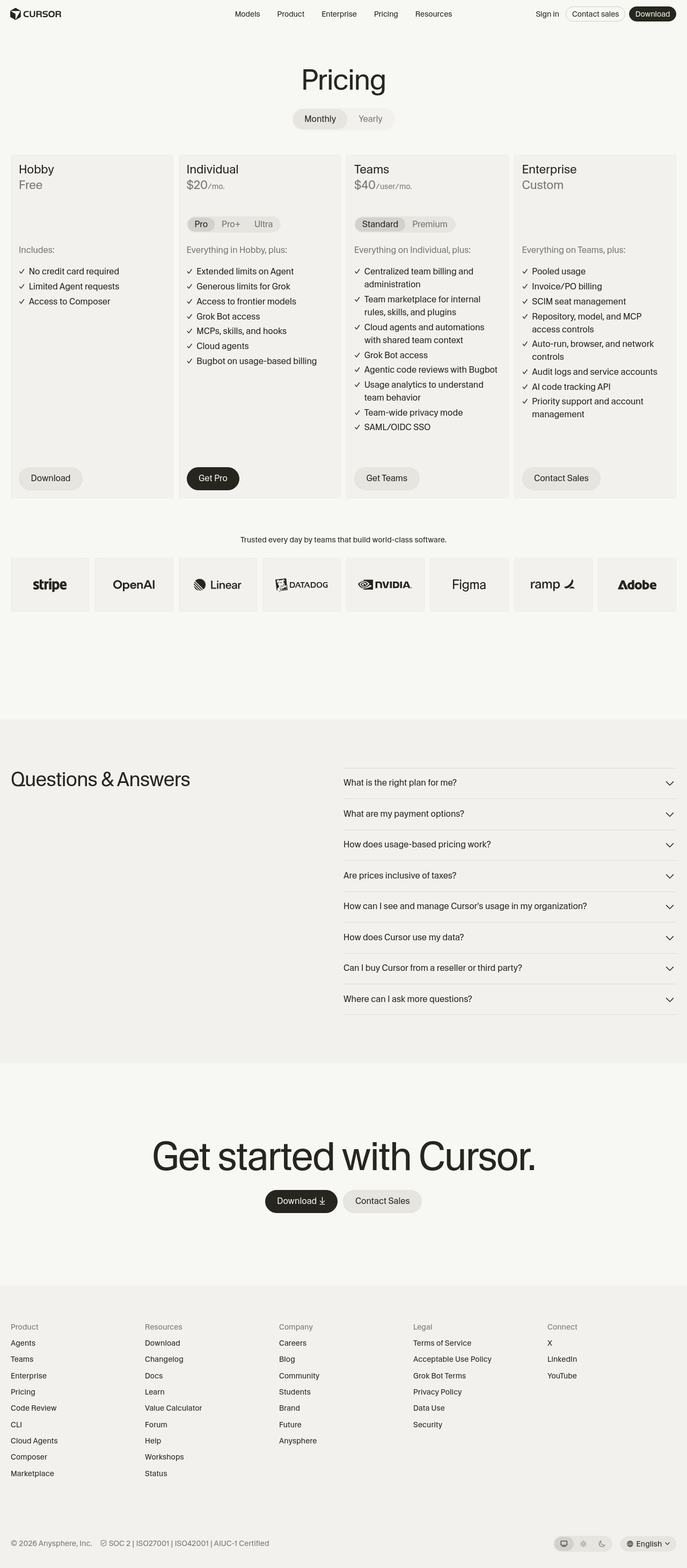
Pricing page, read as a messaging surface.
What works, and it's the strongest positioning on the whole site: - The tier names are a clean audience ladder, Hobby / Individual / Teams / Enterprise. A visitor instantly knows which row is theirs. This is the clearest "who is it for" Cursor has, and tellingly it lives on the pricing page, not the homepage where the audience went unnamed. - The trust block is excellent. "Trusted every day by teams that build world-class software" over a logo wall of Stripe, OpenAI, Linear, Datadog, NVIDIA, Figma, Ramp, Adobe, plus SOC 2 / ISO certs in the footer. This does more positioning work, "serious teams run this", than the hero headline did. Do-not-regress.
What muddies it: - The visible price under-represents the real decision. "Individual, $20/mo" is actually just the "Pro" sub-tier; a hidden Pro / Pro+ / Ultra toggle sits inside the card (and Standard / Premium under Teams). The number you anchor on isn't the choice you actually make. The Q&A even concedes this with "What is the right plan for me?", answering a confusion the layout created. - The real differentiators are buried as undefined jargon. The feature lists name Cursor's actual moats, "Access to Composer," "Bugbot," "Grok Bot access," "MCPs, skills, and hooks," "Agentic code reviews," "Cloud agents", but as bare checklist items. "Composer" and "Bugbot" are Cursor-specific product names a cold visitor can't decode, and they're the things that would justify "why Cursor over the alternative." The page name-drops its weapons instead of selling them.
Made with Cobalt Capture.
Open the live review for the export buttons (markdown, PDF, Word) and the share card.
Run this on your product
Connect the Cobalt server once, then ask for a positioning teardown of your own site. Replace the placeholder URL with yours.
-
Claude Code
/mcp__cobalt__positioning_pass https://your-product.com -
Codex
Run: curl -s https://cobaltcapture.com/playbooks/positioning-pass.md Then follow it exactly against https://your-product.com -
Cursor, VS Code, Claude chat, Perplexity
Run a positioning audit of https://your-product.com
Claude Code runs it as a slash command once the server is connected. Codex has no slash commands: connect with codex mcp add cobalt --url https://cobaltcapture.com/mcp, then paste the two lines. Cursor and VS Code connect with the button above, then take the sentence. In Claude chat or Perplexity, add https://cobaltcapture.com/mcp as a connector and ask in plain words; this study reads public pages, so it runs in full there. What this study checks.
Connect your agent to Cobalt
Cursor and VS Code install in one click. Claude Code and Codex copy a command to run in your terminal, then restart the app.
Cursor is the first product in the teardown gallery: CobaltCapture's own studies, run against products builders already use and published in full. The pricing section above is the pricing page teardown playbook; the positioning section is the positioning audit playbook. Both read public pages only, so they run from Claude chat as well as from a coding agent, and both can be run against your own product with the blocks above.
The prices on this page are what cursor.com showed on the run date at the top of each section. When Cursor changes its pricing page, the pricing study is re-run and this page moves to the new review; the old one stays linked as history.
Frequently asked questions
How much does Cursor cost?
As of September 5, 2026, Cursor's pricing page shows four tiers. Hobby is free with no credit card required. Individual starts at $20 a month for the Pro plan. Teams is $40 per user per month for the Standard plan. Enterprise is custom. Individual also offers Pro+ and Ultra, and Teams offers Premium, but those prices only appear after clicking a switch inside the card, so they were not visible on load. Yearly prices sit behind a Monthly/Yearly toggle that defaults to Monthly.
Does Cursor have a free plan?
Yes. The Hobby tier is free, states 'No credit card required', and on a phone it is the only plan visible at the fold. What it includes is described in adjectives such as 'Limited Agent requests' rather than numbers, so the study could not say how much use it allows.
What is the difference between Cursor Individual and Teams?
Individual is a flat monthly price per person, $20 for Pro. Teams is priced per user, $40 per user per month for Standard, so a team of five pays $200 a month and a company of 25 pays $1,000 a month if Teams is allowed at that size. The page does not state a seat count at which Enterprise becomes required.
Is Cursor worth it?
This study judged the pricing and positioning pages, not the product, so it cannot answer that by itself. What it can say is that the buyer-facing information is incomplete on load: sub-tier prices are hidden behind switches, usage limits carry no numbers, and there is no Enterprise threshold. A buyer should click every switch and read the Q&A before deciding, and a heavy user should ask what an Agent request costs beyond the plan. The page's trust signals are strong: a named logo wall including Stripe, OpenAI, Linear, Datadog, NVIDIA, Figma, Ramp, and Adobe, plus SOC 2 and ISO 27001 marks.
What does the positioning teardown say about Cursor?
That the pricing page positions Cursor better than the homepage does. The homepage fold says 'your coding agent for building ambitious software', which names no user, no job, and no outcome, and would survive a competitor's name swapped in. The pricing page's Hobby, Individual, Teams, Enterprise ladder tells a visitor which row is theirs instantly. The strongest asset on the site is the logo wall of teams that use it.
How was this run?
Two ready-made CobaltCapture playbooks, the pricing teardown and the positioning pass, were run by an AI against cursor.com's public pages with no account created and nothing submitted. Screenshots were rendered server-side on desktop and phone. The pricing page was judged in its default state (Monthly billing, Pro, Standard), so prices behind switches were not captured. The full reviews are linked from each section, and the pricing study is re-run at least quarterly or when Cursor changes its pricing page.
Run your first study.
Give your AI assistant a URL and walk away. Come back to a shareable review with real screenshots and the verdict on top.
Run a study